Website navigation
Give visitors a clear route through the public site
Configure the links in your public header and footer so visitors can reach the pages that matter.
Navigation that follows the purpose of your pages
- Choose destinations
Link an existing website page or an external web address.
- Name the links
Use labels that explain where each destination leads.
- Arrange the order
Maintain an ordered set of links for the selected menu.
Make important pages easy to find
Website configuration separates the header and footer menus. Open the corresponding editor to maintain the destination and label of each link.
Use existing page destinations and meaningful labels. An external URL can lead to a related service such as your help content.
Make useful destinations easy to recognize
Organize a broad product presentation. When a site explains several capabilities, a flat list becomes difficult to scan. Order related destinations and use labels that describe their purpose. The menu should help a reader find the topic needed now while keeping the full catalogue accessible.
Connect the public services. An external link can lead to documentation or another relevant service. Use the correct address and keep its role clear: learning how to use the product differs from signing in or contacting the team.
Keep desktop and mobile paths consistent. Review the applied navigation in the wide header and mobile drawer. A visitor should be able to reach the same important pages in either layout, including links added as the site grows.
Keep the navigation in step with the site
When a new public page is added, review whether it belongs in the menu. Keep the most useful paths visible rather than relying on visitors to guess their address.
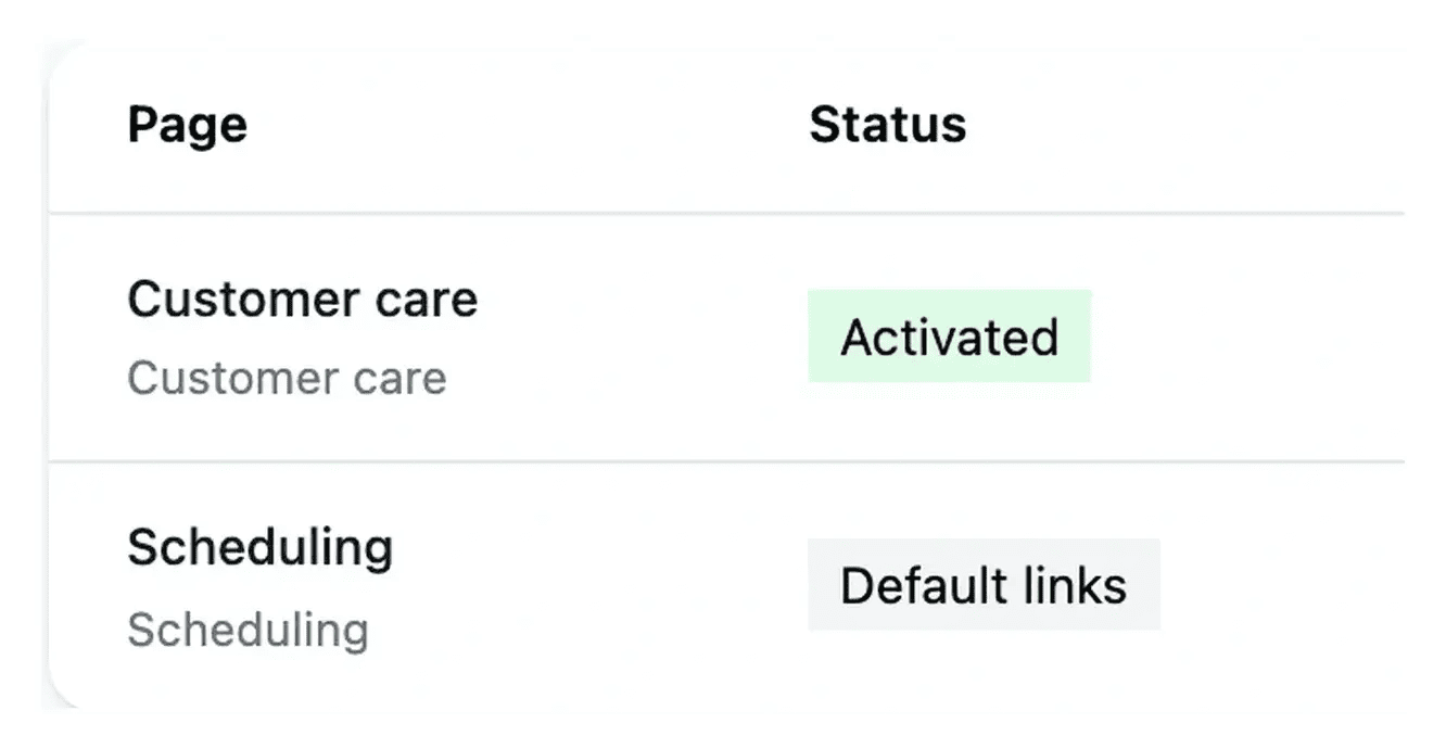
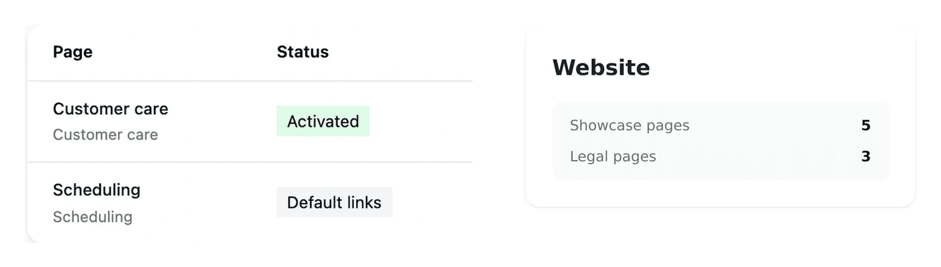
Follow the configuration status and check the built navigation on desktop and mobile. A saved menu change needs to be applied to the published site.
Organize links around the visitor’s next question
Give each link a label a visitor can understand. A small number of clear destinations is easier to browse than a long, undifferentiated list of capabilities.
Check the complete journey on a phone as well as a desktop. Important pages should remain reachable through the mobile navigation and the useful links in the footer.
From link configuration to a working visitor path
Choose the menu. Header and footer are configured separately. Start with the part of the site that should carry the destination.
Review labels and order. Each entry has a label and an existing page key or complete external URL. Keep the ordered list understandable and the targets valid.
Check the applied result. Follow the configuration state, then open the site and test the changed links on desktop and mobile. A saved list still needs to reach the built navigation.

Make the next page easy to find
Give navigation the same attention as the page content: clear labels, coherent destinations and paths that work on a phone.
Questions about Website navigation
They have distinct configurations. Choose the appropriate menu before editing, then verify that the changed links appear in the intended part of the public site.
Use the key of an existing website page or a complete web URL for an external service. Follow the format expected by the editor so the destination is retained correctly.
The editor provides repeatable link rows and removal controls. Keep at least one valid link, review the sequence and save the resulting configuration.
Saving and applying the built navigation are separate stages. Read the configuration state and follow its update before repeating the same edit.
Open the intended destinations, check their meaning and inspect the mobile drawer. The result should remain useful in both layouts, not only in a wide header.